About a month ago now, I spent a couple fun but exhausting days in Milano for a conference. While there I gave a talk, unexpectedly found a yellow soft drink I miss a lot, and of course I also took the tram:
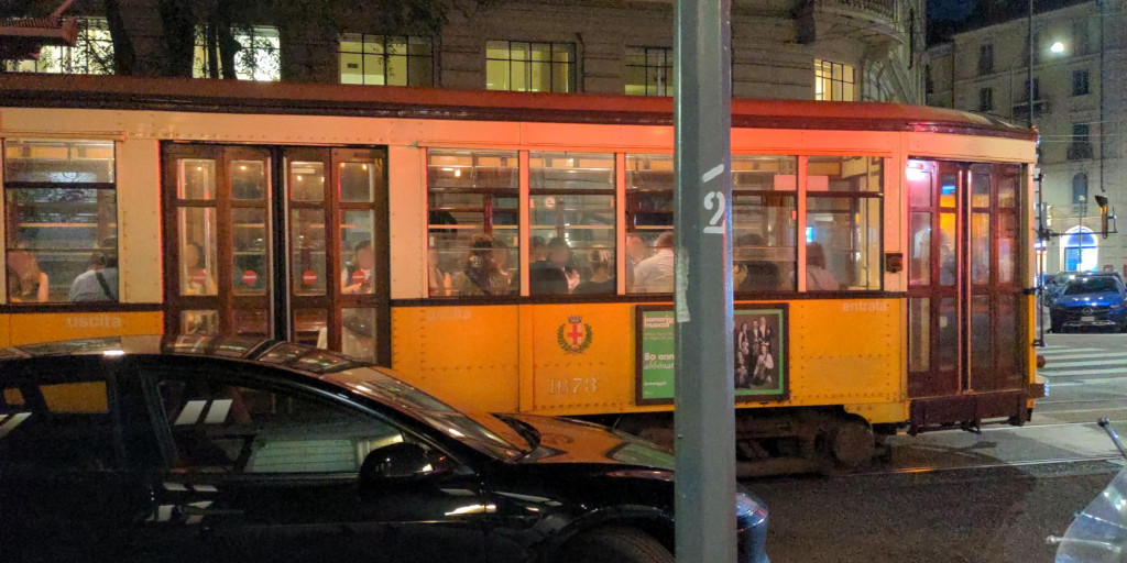
Milano is famous for still having a large number of old trams from the 1920ies running in regular service. And as one of the lines stops directly next to the university campus, I decided to simply get on …
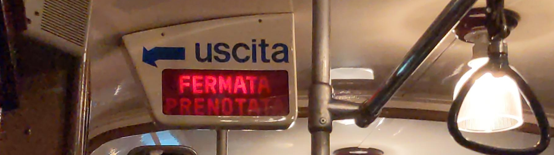
… to quickly discover I had no idea where it was going. At the tram stop, there’d been an information sign for the two lines stopping at it, but only with a list of stations (useless to non-local me, who recognised none of them). So I looked for a map.
Without success! No map at the stop, no map in the tram, and (as I checked later) not even at larger interchange stations. I got off near Cadorna, and then took the metro back — but in the metro station, too, the maps showed only the metro itself and the suburbano lines, not the trams.
À la recherche des cartes perdues
So really, how does one find out which tram to take? Looking around, I did find a couple options:
official
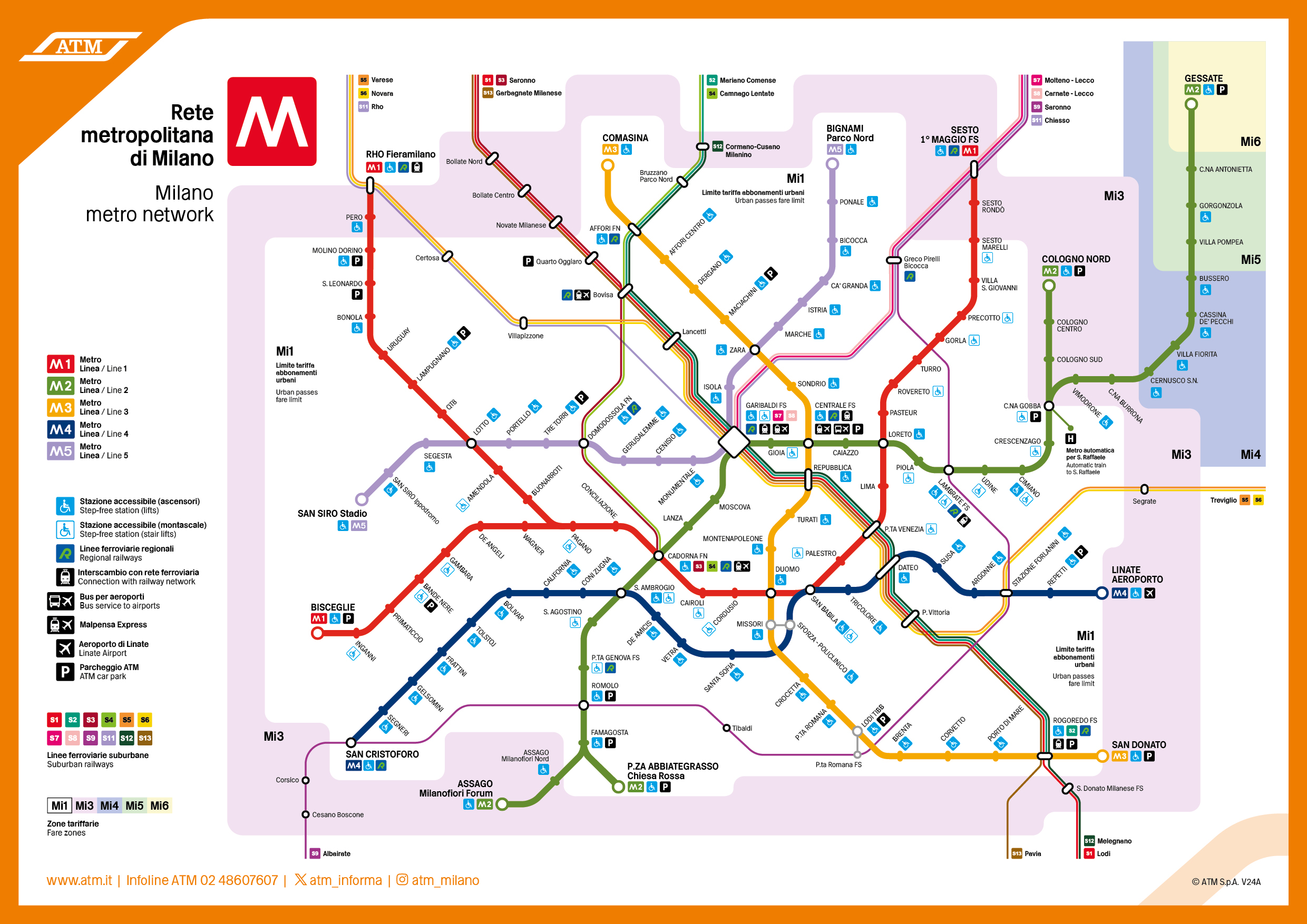
The city’s transit operator ATM has a map displayed at metro stations, but it only shows the metro and (the central parts of) the suburbano train lines. They also have a couple other maps [ATM] listed on their website; confusingly this includes a complete map of night lines, but no equivalent for ‘normal’ service hours.
Unfortunately I didn’t have the time to go bother them at an information desk while I was in the city, so perhaps there are some maps available there — but if so, I’ve not found any of them mentioned online.
As far as I can tell, currently the only official way to navigate the tram (and also the much larger bus) network is via ATM’s mobile apps, or alternatively via its web app [ATMApp]. But no matter how convenient these are for routing, they don’t contain a good map either (and the web app likes to get stuck if one tries to make it display more than a few tram lines at once — not that it would produce a very readable map if it succeeds).
third-party
Finally, there are (of course) various tourist maps of the city’s center and main sightseeing attractions, which sometimes also include the central section of the tram network (although not always in the most readable way), as well as countless third-party web sites and transport wikis containing variously up-to-date information.
Even on WikiMedia (usually a good source of custom-drawn network maps, often much nicer than their official versions) a cursory glance found only a few maps of the tram system. But mostly these are geographical maps first, with extra information squished into them (although looking again I did find this very neat map).
historical
What came before the mobile apps? Surely people must’ve had a way to figure out which tram to take? They did! Fortunately for us, stagniweb [Stagniweb] has preserved an impressive collection of archived historical maps of Milano’s trams, the last of which is dated to 1982:
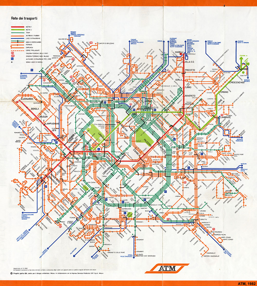
Unfortunately, I’m unclear on what happened after this map — an urbanfile.org blog post [Montella] mentions a similar map from 1985, but sometime after that, ATM seems to have discontinued this format; I’ve not found any official map of the trams from the years since.
By the time archive.org starts having snapshots of ATM’s website in 2011 (before then, the domain belonged to an online shopping business), they already offered the routing app, and seemingly no full network map of the tram lines were available to download then, either — although the site mentions you could still get free paper maps. But if these still included the trams, I’ve not found any pictures of them online.
archive.org troubles
There might well be more information on the wayback machine; I’ve not looked as extensively as I’d like, since it’s currently still very sluggish and often struggles to respond to requests at all.
If anyone has clues on this (or even lived in or visited Milano during that time), feel free to message me, I’d love to know!
Drawing my own
So there I was, sitting in my hotel room, and wondering how to procrastinate on making the slides for my talk (thankfully scheduled for the last day of the conference, so I had some time). Why not try to make my own map?
By complete coincidence, the weekend before I’d been at BayTEX, where Aada had given an amazing last-minute talk [Aada] about how to draw line network maps with TEX, so I had a rough idea of how to go about it.
sketching
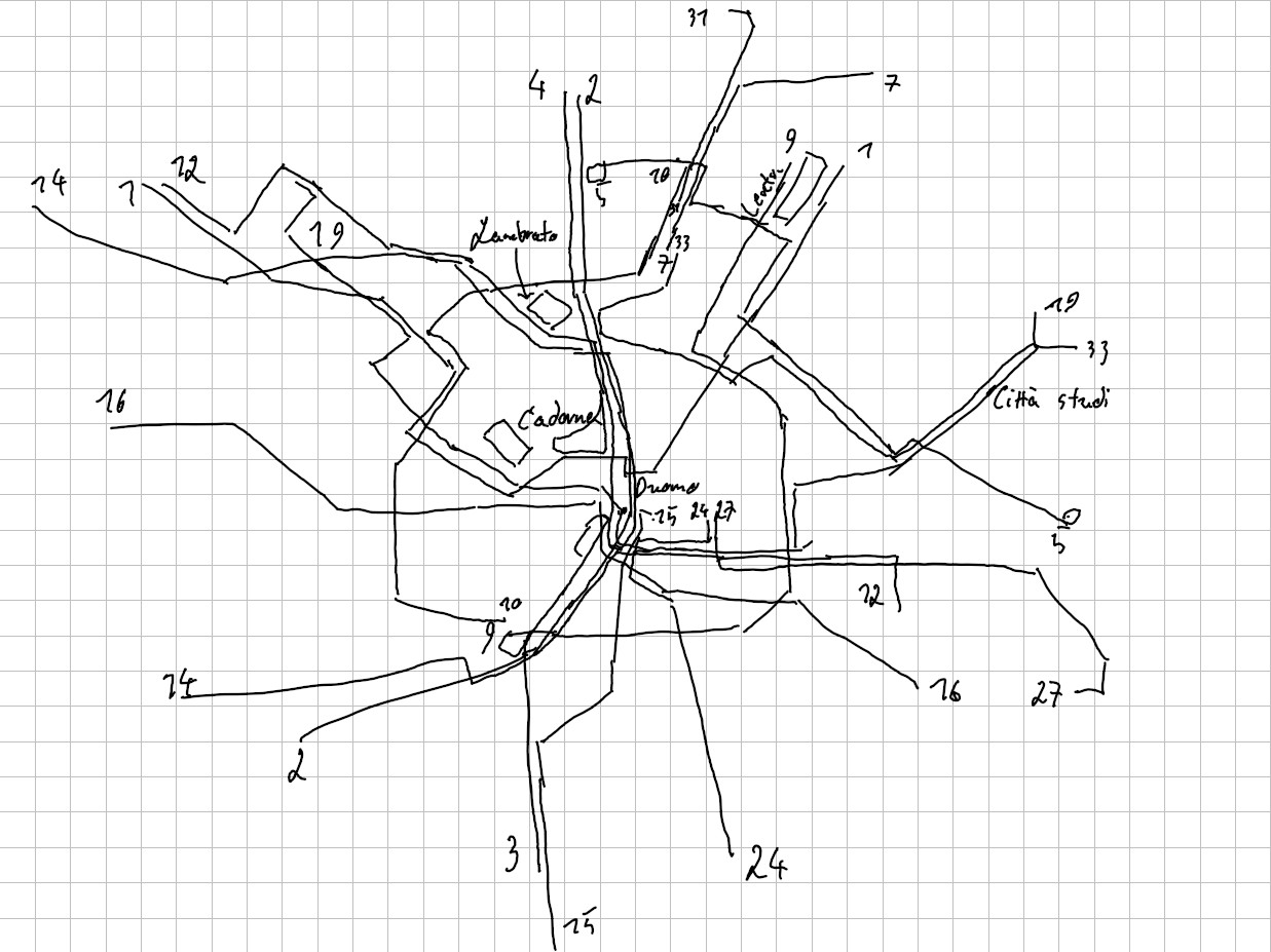
Lacking an official map to get any kind of overview, I fought ATM’s web app for a while (it kept getting stuck) until I had a rough sense where each line goes, and where they meet and cross each other:
And having done that I thought, well, really, how hard can it be to do this with TikZ? All I have to do is to re-use Aada’s framework and shapes, surely the rest is doable, too?
tikzpictures
Aada’s maps rely on tikzpictures to do most of the heavy lifting involved in creating pictures.

Depending on your background, you might have a certain intuitive aversion to TikZ — or at least I’ve found that many academics who use TEX for their papers are wary of it, and its 1300+ page manual has a reputation of its own – but it is (surprisingly?) one of the least bad tools for this kind of task:
- compared to most (vector-)graphics programs, there’s a usable macro system.
- it’s possible to build (albeit leaky) abstractions over the shapes used to draw the map.
- drawings made with TikZ are parametric: nodes can be set relative to other nodes, so the network’s layout stays relatively flexible even with all lines and stations filled in.
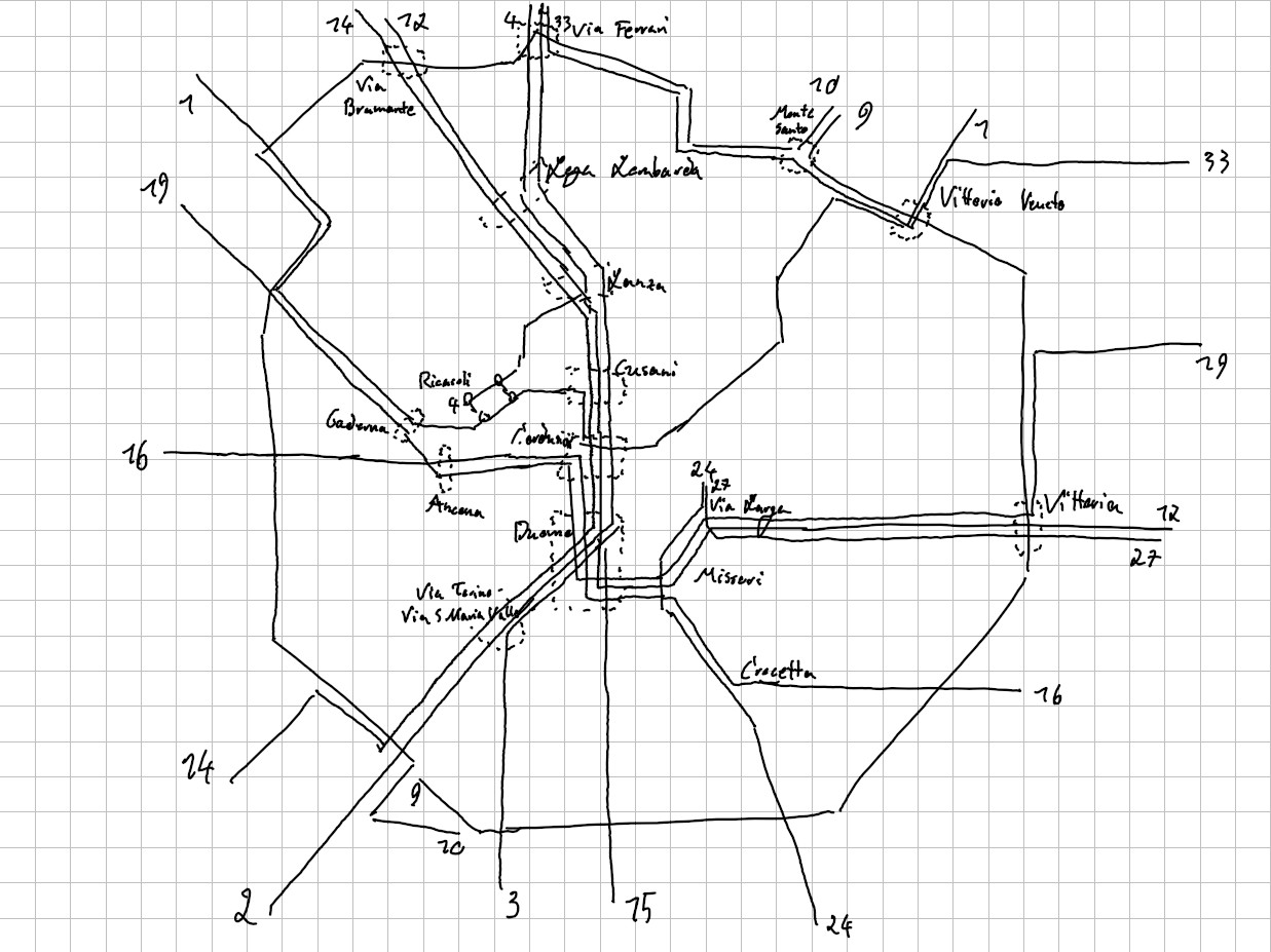
A decision I made very early on was to use lines 9 and 10 as “anchors” for the rest of the network, as they form a nice circle around the city’s center. This wasn’t the best idea — it kept getting crowded when I filled in the central stations later — so if you intend to design your own map, I’d advise to grow it “outwards” instead: start with the most complex central stations, and then slowly add the rest around them.
Of course, using TikZ for this sort of thing does have its annoyances:
- most obviously, it involves writing text; results are only visible after calling TEX.
- there’s thus all the usual problems that come with writing several hundred lines of code in any language; it’ll easily turn into spaghetti. Though if that happens, one can always define more macros …
- the biggest by far: TEX is fundamentally unsuitable for creating
true, non-leaky abstractions (barring some hackery with catcodes, as e.g. expl3 does),
and various macros defined by TikZ have strange, unexpected limitations
— for example, a
\\occurring inside a\foreachwill usually break things, especially if it is text inside a node.
\pgfplotsforeachungrouped
The “\\ inside \foreach” problem turns out to be distinct from the more common
“\\ inside a node” problem, which is usually solved by simply giving the node
a text alignment scheme and an explicit width; something else inside the \foreach
also seems to break whenever there is a \\ in an iteration’s output group.
There are Workarounds for this, but these involve liberal use of \edef / \expandafter.
There
is a \pgfplotsforeachungrouped which is more robust against this kind of thing,
but which also does not support multiple loop variables (although the pgfplots
documentation appears to imply it should). However, given the sometimes absurdly
long station names I desperately needed line breaks inside labels.
In the end my solution was to write a little expl3 function which replaces
| by \\, and that does work ..
Unfortunately it turns out drawing one of the largest tram networks in Europe is not doable in an evening in a hotel, so I left Milano (and the conference) with a very unfinished map. But over the following weeks I kept coming back to it, fiddling around until the overall layout looked mostly usable.
so many stations …
After that TikZ could really shine: filling in all the other stations was a breeze,
and done in only a couple hours (most of which were spent learning just enough
expl3 to build a useful macro for nicely setting multi-line labels in odd locations
from inside a \foreach).

I say “lacking some information here,” but really what’s going on is that [ATMApp] only ever shows you real-time data. In case of a diversion or temporary line closure, there will be a free-form text describing the disruption, but no information on the intended, original route.
In some places, I cobbled the information I needed together from [OSM] and [WiRo], even though the latter of these is at least partially out of date.
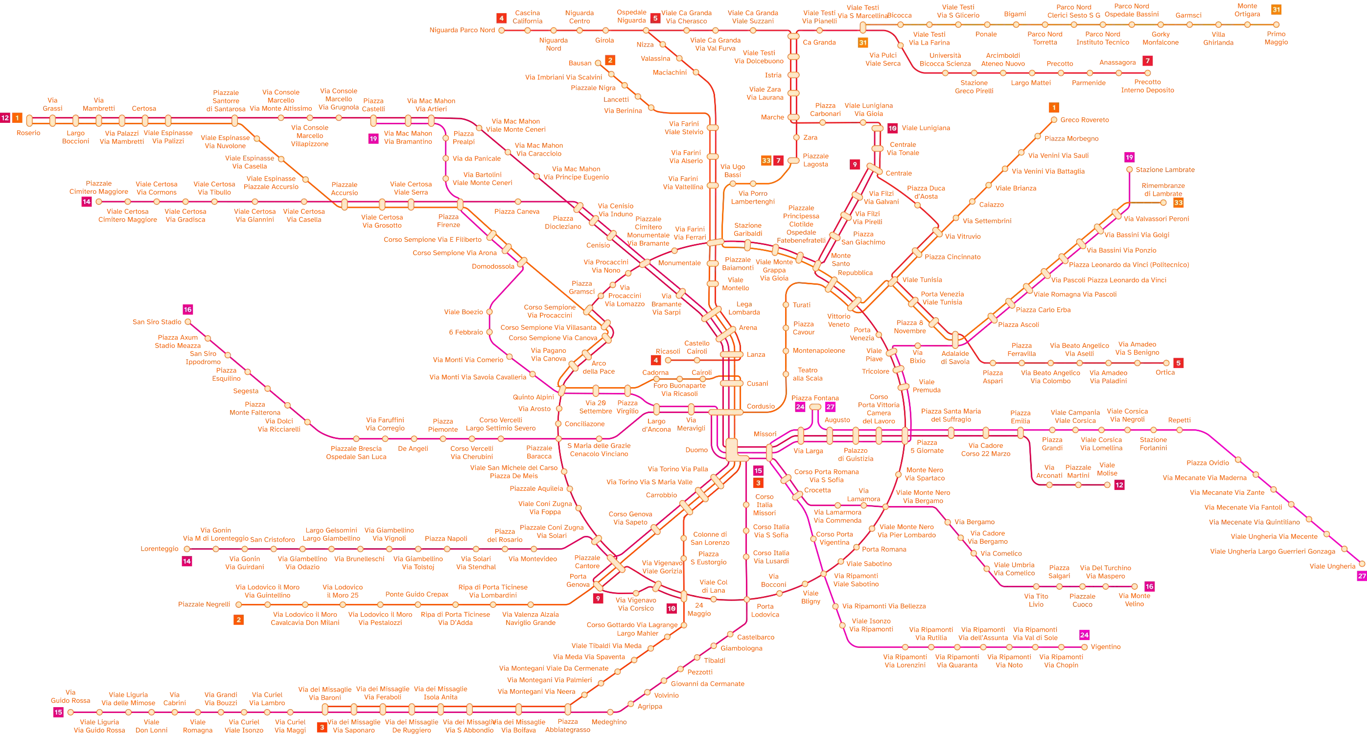
And well, here it is. A mostly-accurate map of Milano’s trams. While it has a few known defects (some routes take a slightly different route in either direction, and sometimes there was some guessing involved due to [ATMApp] lacking some information), I am overall quite happy with the result:
- The overall layout of the lines is very clear, with geographic convolutions smoothed out in favour of their topology.
- I could entirely avoid rotating text even for very long station names (“Piazzale Principessa Clotilde Ospedale Fatebenefratelli”), which I’ve never found aesthetically pleasing. (I also avoided the common Italian shortenings like “P.le.” for “Piazzale” simply because I discovered I could.)
- Despite some complications, it’s (almost) always easy to see which station a label belongs to, and the labels mostly don’t overlap anything else.
And now?
Some information essential to a usable transit map is still missing: there probably ought to be a legend, stations outside the City of Milano should probably be marked as such, fare zones and interchanges to other modes of transport could be added in … but I don’t really have plans to add these for now; the fun for me was in drawing the network itself.
another map
And of course, having finally finished drawing the network, I find that somebody else had already done it: there’s a map I somehow missed before on reddit [Santín].
Not only does it show all tram lines, but also the central sections of both metro and suburbano lines.
It’s been fascinating to compare to my own map, and re-discover some of my own choices in it — but also decisions done differently: 9 and 10 do not form a circle, the lines around Duomo and Cordusio are handled differently, etc. …
Perhaps I could now integrate both metro and suburbano into my map as well; they both intersect with the tram network heavily, and are also useful transit modes inside the city’s core. Otoh there’s very little chance I will ever add the bus lines …
can’t we automate this?
Several people, when seeing what I was working on, immediately asked: why have you written 1500 lines of TEX for this, a task which surely can be automated?
I think there’s two answers to this: first, this kind of ‘planarisation’ isn’t really easy at all. For one, it’s unlikely the network graph is planar, thus choices must be made on where it should overlap itself. But there’s a lot more: how much should it abstract, how true should it be to geography? How and where to place labels, and how to make them fit next to a well-connected interchange? Nor is planarity the same a clarity: even if no lines ever cross over at all, a reader might still easily get ‘lost’ when attempting to understand the network depicted by the map.
Thus, secondly: while we can insist on imagining a transit map as the result of a large optimisation problem, in the end there’s a lot more of art to designing it than there is graph theory. After all, its purpose isn’t to depict a graph, but to communicate helpful information to people who don’t know their way around an unfamiliar city. That it depicts a graph is only incidental.
This is not to say we can’t perhaps make the process of designing such a map a little less onerous. There’s some fun ways of drawing transit lines onto geography [trapp], or even automating the entire thing, but in an interactive way so a person can still decide on at least some of the ‘choices’ made inside the map [Janiak].
conclusion & advice for making your own
Finally, perhaps you feel — for whatever reason — the insatiable need to create a similar map yourself. Perhaps your local city lacks a good map (or any map). Perhaps it does have a map, but it’s outright wrong in how it displays some lines (this is waay more common than I used to think). Regardless, here (in no particular order) are some useful things I learnt along the way:
- Drawing a rough sketch by hand first turns out to be a very good idea. Whatever program you use to draw the graphic later, it’s always clunky to re-organise many lines at once; starting a new, improved rough sketch is easier.
- This is doubly true if you don’t have an existing map to guide you.
- Your final map will look very different than your sketch. Start with the most difficult, most densely clumped section of the network, it’ll change the most (and afterwards you can be glad to have that behind you)
- don’t forget to think about where labels go; compared to lines / stations, they take up a lot of space!
- If you’re using TikZ, it pays to have several “anchor” stations, and place everything else relative to these in an outwards-growing dependency tree.
- Also if using TikZ: read a little of the manual first! Yes, it does have 1300+ pages. But it’s really useful to know about all the fun ways to specify coordinates.
- Learn some expl3 while you’re at it, and try not to use the pgf
\foreachunless you really need to, it’s brittle and will break on you later in entirely unexpected ways.
And most importantly, have fun with it! Don’t be afraid to make unexpected design choices and see where they lead you! And if you get stuck, nerdsnipe some of you friends into looking at it; transit maps turn out to make for a fun social activity — I’d especially like to thank io for so many good suggestions for my own map, along with Aada for having the initial idea of drawing these with TEX.